The strongest call-to-action setup pairs one action-first, benefit-focused primary button with a lower-commitment secondary link nearby. Your primary CTA might read “Start my free trial” while the secondary offers “See how it works.” Place both above the fold and again after any long-form content. The copy-ready examples and design rules below show you exactly how to build that pairing for your own site.
TL;DR:
- Using contrast and ample padding increases CTA button visibility and tap accuracy, especially on mobile devices, boosting conversion chances.
- Pairing one dominant, high-contrast primary CTA with a softer secondary link captures both ready-to-act visitors and those still considering options.
- Writing CTA copy as an action verb plus a specific benefit, in first-person, significantly improves click-through and engagement rates.
- Testing one variable at a time—copy, color, placement, size—and running each test for at least one week ensures reliable performance data.
- For service websites, concrete, benefit-focused CTAs like “Claim my free site audit” outperform generic “Contact us” prompts, generating higher-quality leads.
Table of Contents
- CTA Examples by Use Case (Copy-Ready)
- Design and Placement Rules for CTA Buttons
- Primary vs. Secondary CTAs: When to Pair Them
- How to Write CTA Copy That Converts
- Testing and Measuring CTA Performance
- CTAs for Contractor and Service Websites
- Three Rules I’d Apply to Every CTA Project
- Turning These CTAs Into Booked Jobs
- Sources
- FAQ
CTA Examples by Use Case (Copy-Ready)
You don’t need to write CTA copy from scratch. Below are tested phrase patterns grouped by the goal they serve, organized around the split that copywriting experts use: direct CTAs that ask for an immediate commitment, and indirect CTAs that ease a visitor further into your funnel. Direct phrasing works at the bottom of the funnel, where someone is ready to buy or sign up. Indirect phrasing works earlier, when a visitor is still deciding whether to trust you.
E-commerce CTAs
- “Buy now”
- “Add to cart”
- “Claim 20% off today”
- “Shop the sale”
- “Reserve yours before it sells out”
Notice the last two lean on urgency. Scarcity language works in e-commerce because the buying decision is usually low-risk and fast. It backfires in higher-trust categories like B2B software, where pressure tactics can make a visitor suspicious instead of motivated.
Lead generation and gated content
- “Get my free guide”
- “Download the checklist”
- “Send me the template”
- “Unlock the full report”
These all follow a first-person, benefit-first pattern. “Get my free guide” consistently outperforms “Download PDF” because it puts the reader’s own gain in the sentence rather than describing a file format nobody cares about.
SaaS and free trials
- “Start my free trial”
- “Try it free for 30 days”
- “Create my account”
- “See pricing”
Pair a trial CTA with a softer secondary link like “Watch a 2-minute demo” for visitors not ready to hand over an email address yet.
Newsletter and content subscriptions
- “Send me tips”
- “Get weekly insights”
- “Join 10,000 subscribers”
- “Sign me up”
Skip generic “Subscribe” buttons. They describe the mechanism, not the reward. “Get weekly insights” tells the reader what they’re actually signing up to receive.
App downloads
- “Get the app”
- “Install now”
- “Download for iOS”
- “Try the app free”
Platform-specific phrasing (“Download for iOS” versus “Get the app on Android”) reduces friction because it confirms compatibility before the tap.
Bookings and appointments
- “Book a consultation”
- “Schedule a demo”
- “Reserve my spot”
- “Check available times”
Nonprofit and donation CTAs
- “Give now”
- “Sponsor a child”
- “Donate $25 today”
- “Start my monthly gift”
Donation pages benefit heavily from specific dollar amounts and recurring-gift framing, since both reduce the mental math a donor has to do before committing.
A pattern runs through nearly every high-performing example above: first-person phrasing. HubSpot’s research on personalized CTAs found that copy completing the sentence “I want to…” tends to convert better than second-person phrasing, because it shifts the psychological ownership of the action onto the reader. “Start my project” reads differently than “Start your project,” even though the buttons do the same thing. Test both on your own site before assuming one wins universally, but default to first-person as your starting hypothesis.
Design and Placement Rules for CTA Buttons
A perfectly worded CTA still fails if nobody notices it. Contrast is the first lever. Your button color needs a contrast ratio strong enough to separate it from the surrounding page, not just a color that looks nice in your brand palette. A soft pastel button on a white background might match your style guide and still get ignored.
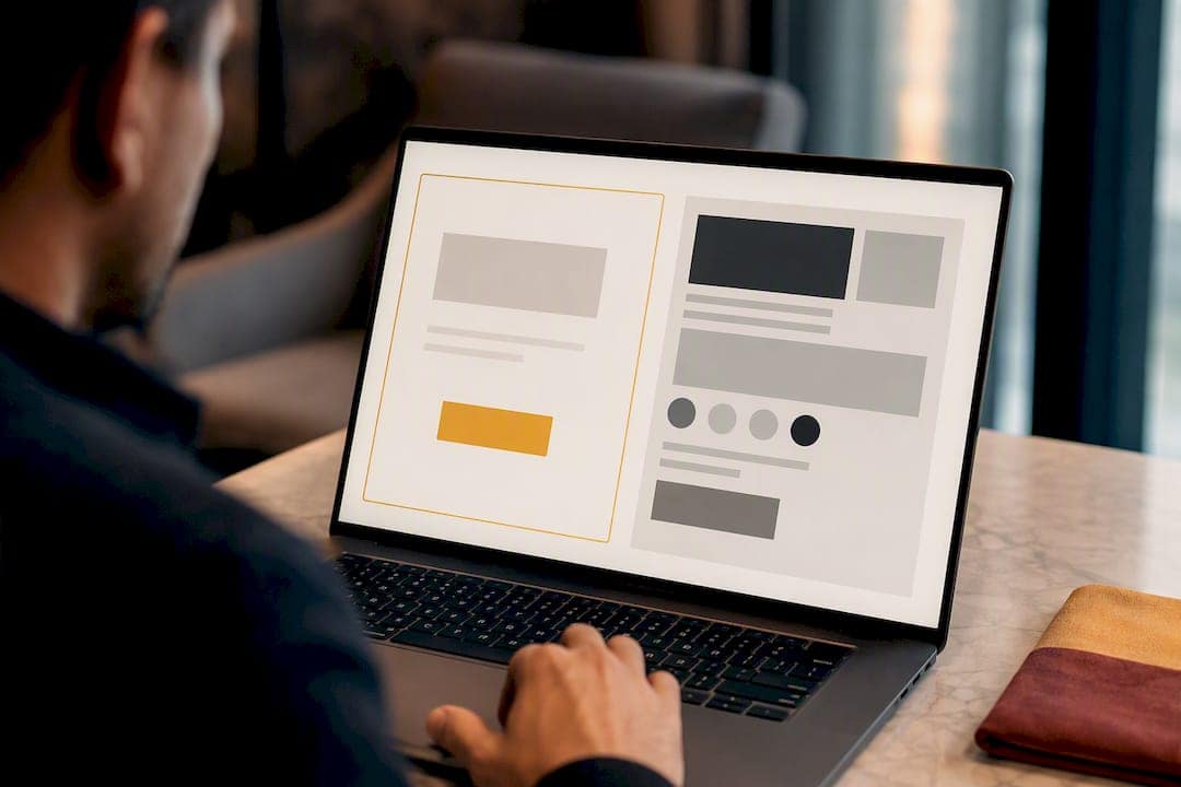
Size and touch targets matter more on mobile than most site owners realize. A button under 44 pixels tall is genuinely hard to tap accurately on a phone, and a missed tap costs you a conversion just as surely as bad copy does. Give your CTA generous padding, roughly 12 to 16 pixels vertically and 24 pixels horizontally, so it reads as a button rather than a link that happens to have a border.
Placement follows a few reliable patterns:
- Above the fold for visitors who arrive ready to act (paid traffic, branded searches).
- After key benefit sections for visitors who need convincing first.
- Sticky headers or footers on longer pages, especially mobile, where scrolling back up to find a button is a real drop-off point.
Sticky CTAs work well on long-scroll service pages and blog posts but can feel aggressive on short pages where the button is already visible. Use them when your content runs past two or three screen heights, not by default.
Whitespace does more heavy lifting than most designers give it credit for. A button surrounded by empty space draws the eye even at a modest size, while the same button crammed next to text and images gets lost. Icons and small badges (“Free,” “No credit card required,” “Limited spots”) next to a button can nudge hesitant visitors, but overusing them clutters the exact element you’re trying to make easy to click. Shopify’s collection of merchant CTA examples shows this pattern clearly: the highest-converting buttons pair a short label with a single supporting detail nearby, like a shipping note or a review count, rather than a wall of qualifiers.
Primary vs. Secondary CTAs: When to Pair Them
Every page should have one primary CTA: the single action you most want a visitor to take. Everything else is secondary. A homepage might push “Start my free trial” as primary while offering “Watch a demo” or “See pricing” as secondary options for visitors who aren’t ready to commit yet.
This contextual pairing captures both audiences on the same page instead of forcing every visitor down one path. A common structure looks like this:
- Primary: “Book a consultation” (bold button, high contrast)
- Secondary: “See how it works” (text link or outline button)
Some pages extend to a “rule of threes,” adding a third low-friction option like “Read customer stories.” Beyond three choices, you risk choice paralysis, where visitors hesitate instead of acting. Keep your primary CTA visually dominant. Your secondary option should always look secondary, whether through outline styling, smaller size, or muted color, so the visual hierarchy matches the decision hierarchy you actually want.
How to Write CTA Copy That Converts
Strong CTA copy follows a simple structure: action verb plus specific benefit. “Get my free guide” beats “Submit” because it names both the action and the reward in four words. WordStream’s copywriting research backs this directly: swapping passive words like “Submit” for reward-oriented verbs such as “Get,” “Start,” “Join,” or “Claim” makes a button read like a bridge to something the visitor wants, not a form-processing instruction.
A few templates to test on your own pages:
- “[Verb] my [specific outcome]” — “Start my 30-day trial”
- “[Verb] [number] [benefit]” — “Get 3 free quotes”
- “[Verb] before [deadline]” — “Claim your spot before Friday”
Specificity beats vague enthusiasm every time.
Pro Tip: Write five CTA variants for your top landing page right now, swapping only the verb (Get, Start, Claim, Try, Join) while keeping the rest of the sentence identical. Run them as an A/B test before you touch anything else on the page.
Testing and Measuring CTA Performance
Test one variable at a time, in this order of impact: copy first, then color, then placement, then size. Copy changes tend to move conversion rates the most because they change what the visitor believes they’re getting, not just how it looks.
Track these metrics for every test:
- Click-through rate (CTR): how many visitors click the button relative to how many saw it.
- Conversion rate: how many clicks turn into a completed signup, purchase, or booking.
- Micro-conversions: smaller signals like scroll depth past the CTA or time on page, useful when your main conversion event is rare.
Conversion research from WordStream recommends testing copy, color, placement, and size as separate variables and segmenting results by device, since a button that performs well on desktop can underperform badly on mobile. Run tests for at least one to two full weeks to capture weekday and weekend behavior, and don’t call a winner until you have enough traffic for the result to hold up. Ending a test after two days because one version is “ahead” is the single most common mistake site owners make. It usually just means you haven’t seen enough data yet.
CTAs for Contractor and Service Websites
Generic “Contact us” forms underperform badly on home-service sites because they ask for effort without promising anything specific in return. Better options: “Claim my free site audit,” “Book a local callback,” or “Start my project estimate.” Each one names a concrete next step and a tangible outcome.
Landing pages built around one of these CTAs, paired with a short form (name, phone, service needed), consistently generate more qualified inquiries than a standard contact page. This is the model behind landing pages built for contractor websites, where a single clear action replaces a generic inquiry form.
Three Rules I’d Apply to Every CTA Project
Every project I’ve reviewed teaches the same three lessons. First, specificity beats enthusiasm. “Get my free roof inspection” will always outperform “Learn more” because it removes the guesswork about what happens next. Second, your secondary CTA is not optional; it’s what keeps you from losing visitors who aren’t ready yet. Third, nearly invisible CTAs sometimes win. A quieter button can filter out low-intent clicks and leave you with fewer, better leads. Test for lead quality, not just volume, and let the data settle arguments that opinions can’t.
— Luis
Turning These CTAs Into Booked Jobs
Writing the right CTA is only half the job. It needs a landing page built to support it, fast load times, clean design, and local SEO that gets the right visitors there in the first place. They build that whole system for home service businesses, not just the button.
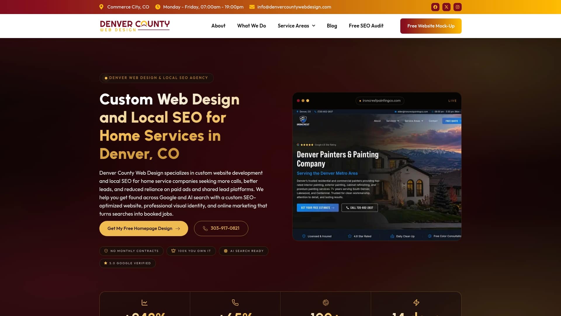
Instead of a slow agency build with monthly retainers, this service delivers custom WordPress sites you own outright, paired with local SEO and Google Business Profile work that helps contractors rank on Google Maps. Clients can benefit from faster launches, more qualified leads from CTA-driven landing pages, and full control of their site without recurring fees. If you want your service pages built around CTAs like “Book a local callback” instead of a generic contact form, claim a free SEO audit and see exactly where your current site is losing leads.
Sources
For deeper research on CTA copy and testing, HubSpot’s call-to-action example library covers dozens of real-brand buttons. WordStream’s conversion rate optimization data breaks down what to test and why. Shopify’s merchant CTA guide shows contextual design examples, and this local SEO content strategy guide covers how CTAs fit into broader local search planning.
- 50 Effective “CTAs” (Calls to Action), with Tips | Grammarly
- 31 Call to Action Examples + How to Write Your Own | WordStream
- Call-To-Action Button Examples + Tips for Making A Great CTA (2026) – Shopify
FAQ
What is a CTA example?
A CTA example is a specific button or link phrase that tells a visitor what to do next, such as “Start my free trial” or “Book a consultation,” rather than a generic instruction like “Submit” or “Click here.”
What are good CTAs?
Good CTAs pair an action verb with a specific benefit, like “Get my free guide” or “Claim 20% off today,” and use first-person or direct phrasing depending on where the visitor is in their decision process.
Can you give me an example of a call-to-action button?
“Book a free local estimate” is a strong example for service businesses because it names a concrete action and removes ambiguity about what happens after the click; e-commerce sites often use “Add to cart” for the same clarity.
What is the best CTA?
There’s no single best CTA. The strongest approach is an action-first, benefit-focused primary CTA paired with a lower-commitment secondary option, tested against your own audience rather than copied blindly from another site.